I took this Creative Photography class my last semester of college, when I was going through a really difficult time in my life. I was dealing with crushing depression, and this class really helped me express it through our projects. This class was all about how photography could be used in other mediums, and how it could be manipulated in the physical form.
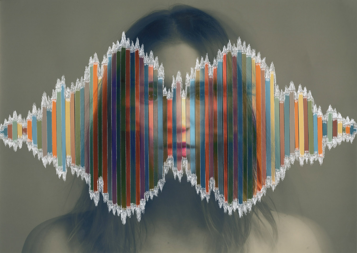
Our first project was to create an image by “cutting.” Here’s my artist statement for this project, which I titled “Not Enough”:
“This image is a self-portrait that I shot during a time when I felt really inadequate in life. The dull, monotone base image expresses how I go through my days when I’m feeling inadequate, because I usually hide my emotions and just go through each day with a stoic front, dull and lifeless. The colored strips represent how I actually feel, and all the different emotions I am experiencing but not outwardly showing. The shape that the strips are in represent an actual sound wave of me yelling “not enough.” The high points of the sound wave occur right where there is a blurred image of me screaming. I chose the phrase “not enough” because it’s an accurate depiction of how I feel most of the time. I’m not motivated enough, good enough, happy enough, outgoing enough, etc. The scratches around the edge of the sound wave represents how these feelings are tearing me up inside and tearing out of me, because I can’t hold them back anymore.”
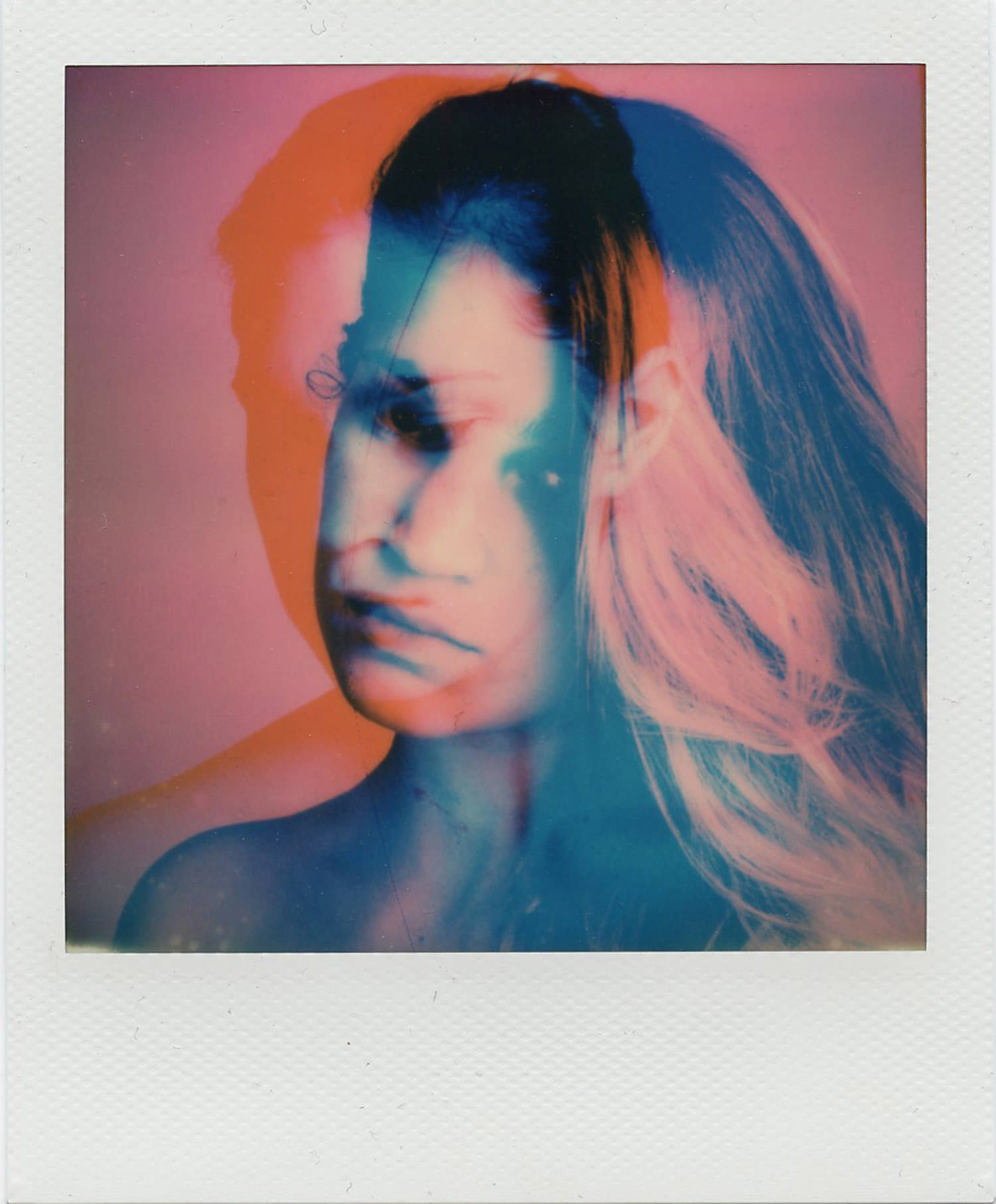
Our second project was to create a Polaroid double exposure, made with The Impossible Project Instant Lab. We took two digital images and combined them into one! Here are the two digital images I combined.
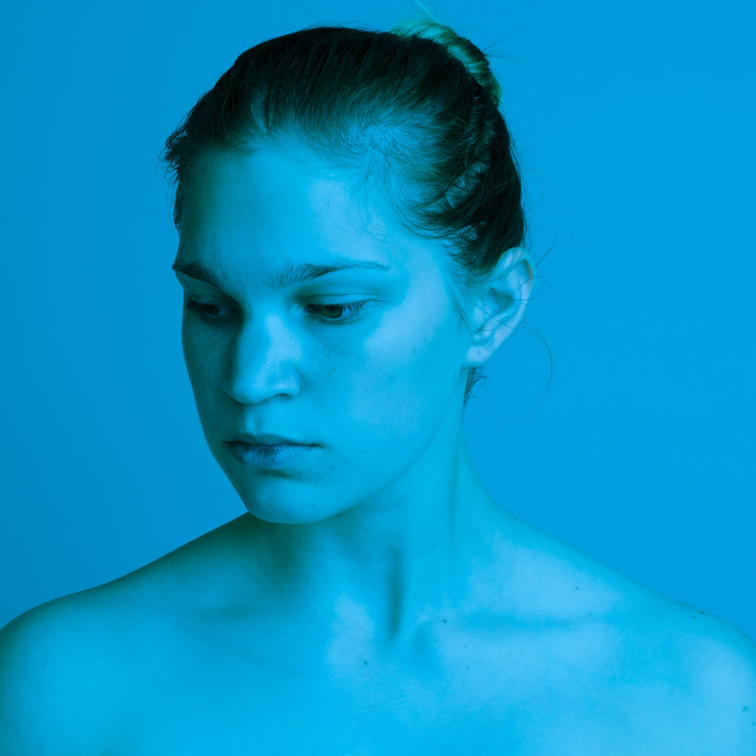
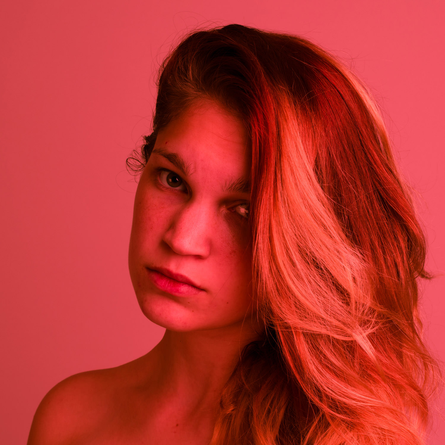
And here’s the final image when combined. When I created this I was having a really hard time, and I decided it was time to confront my emotions rather than running from them. This depicts the constant battle of the confusing connection between anger and sorrow. Here’s my artist statement:
“For this project I wanted to play around with colors primarily. I chose red and blue because they are both strong colors on their own, but they also generally represent anger and sadness respectively. The images I chose to use are self portraits I shot to express my emotions simply and freely, without trying to hide from them anymore. I thought they worked really well with the color overlays over them, and as a double exposure I wanted to express how anger and sadness are so opposite from each other, yet they are so closely connected and can overlap and get confused really easily.”
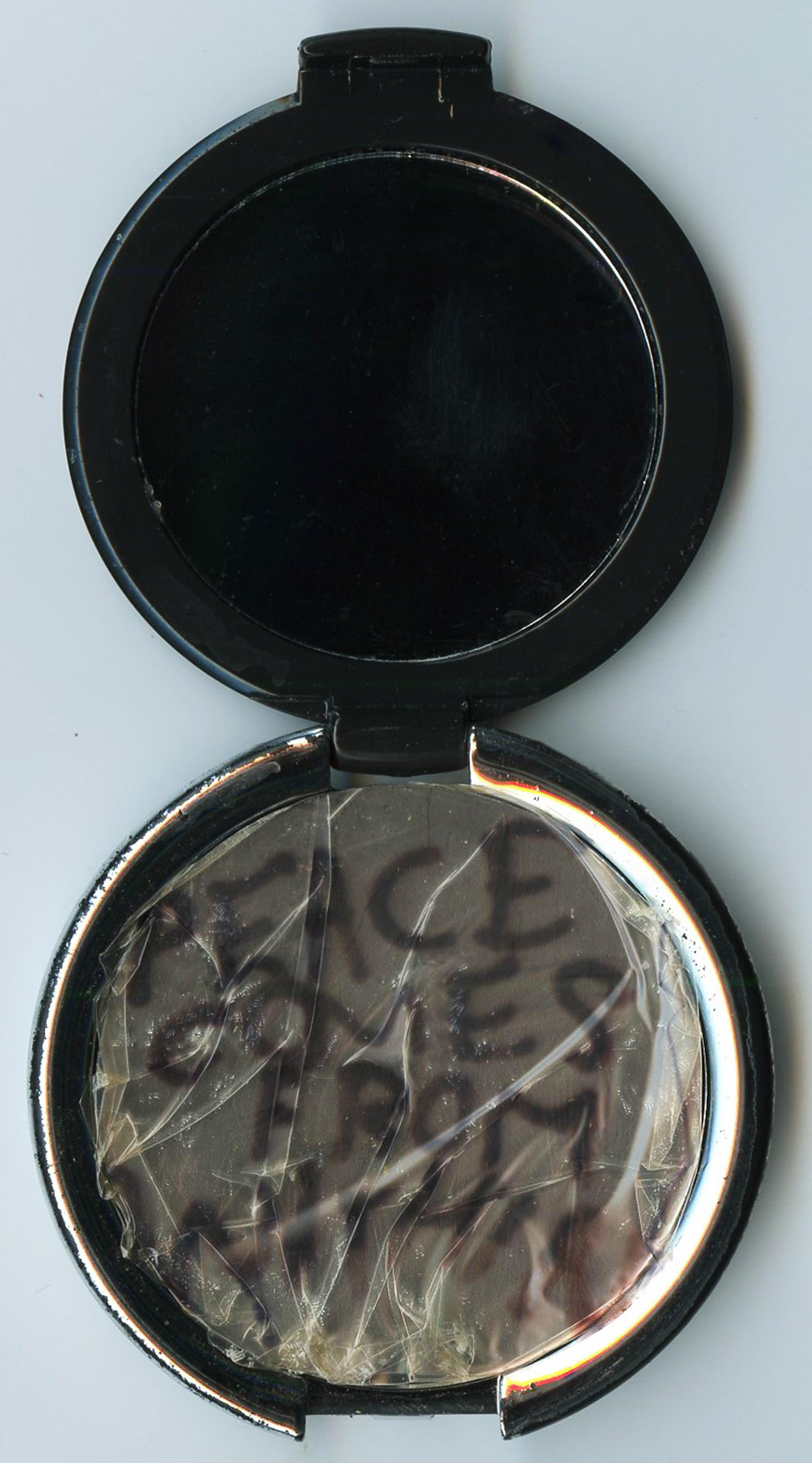
Our third project was a Polaroid transfer. Artist statement:
“For this project, I used an image of graffiti to use as the transfer, which says “peace comes from within.” I wanted to transfer this image to a little pocket mirror, so that anytime someone goes to look at themselves with the mirror they would see this phrase instead. I wanted it to be a reminder that your value or self-worth shouldn’t come from your appearance, so you shouldn’t have to be constantly checking yourself in the mirror. The graffiti on the transfer is reminiscent of lipstick writing on a mirror, and I created little folds in the transfer to appear as if the mirror itself is cracked and broken.”
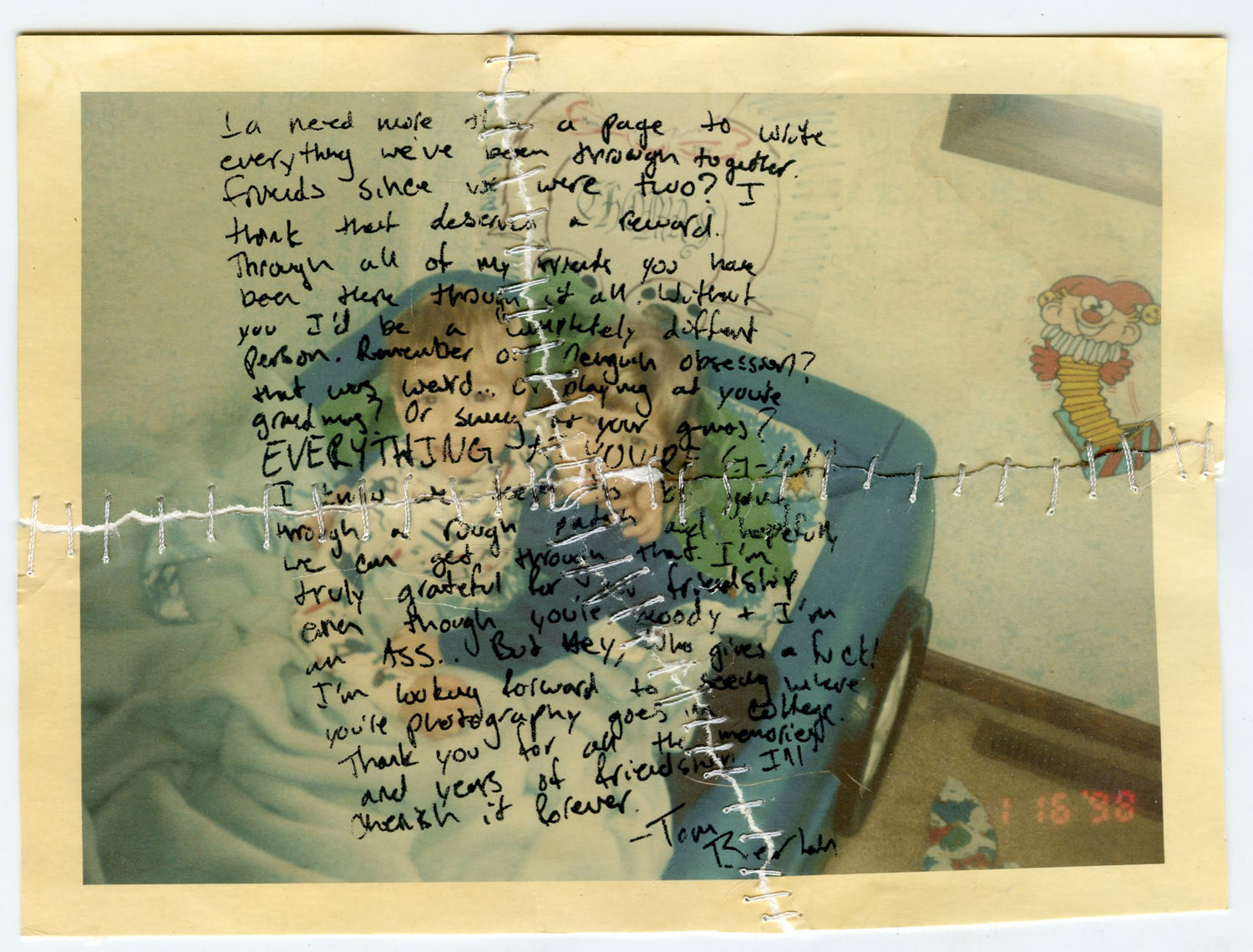
For our fourth project we just had to manipulate a printed photograph in some way. Here’s what I did, and my artist statement:
“For this assignment I wanted to depict the strength and endurance of friendship. I printed off an old picture of me and my friend Tom from when we were just little kids. We’ve been best friends ever since I can remember, and this is the oldest picture I have of the two of us. I stained the print to make it look more aged, and I ripped it up apart to represent the hard times that our friendship has gone through over the years. I decided to hand stitch the image back together instead of just using tape to physically represent our friendship being stitched back together, the hard work that it takes, the permanence of our friendship no matter the hardships we go through, and the fact that our friendship isn’t always going to be perfect. The writing on the image is an acetone transfer of what he wrote in my senior yearbook right before graduation and when we would be going seperate ways for the first time in our lives. During this time period our friendship was definitely strained and we weren’t really talking that much. His yearbook inscription was our first step to stitching our friendship back together and reminding us how much we’ve been through together and how important our friendship is to each other.”
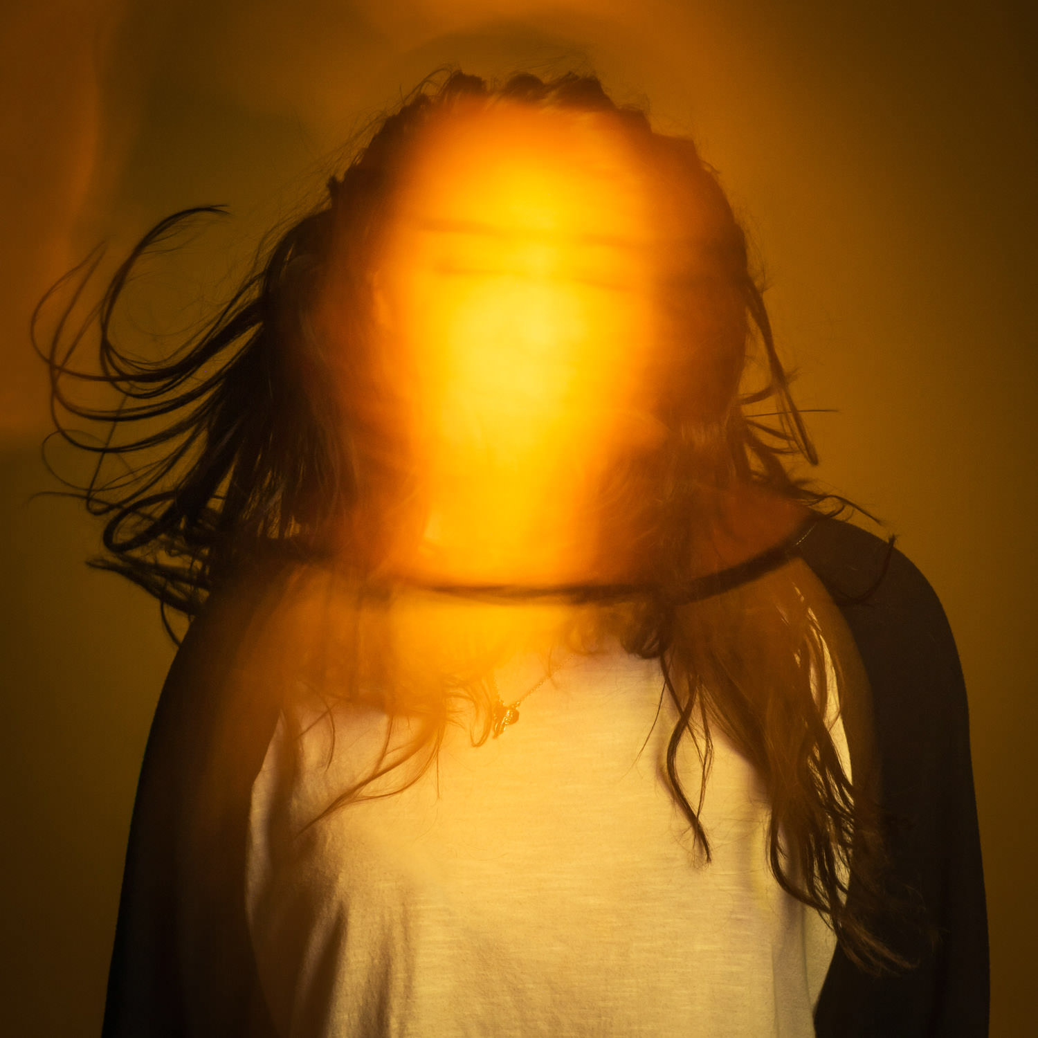
Our fifth project was to shoot a portrait incorporating light painting. This one was honestly a huge struggle for everyone, me especially, but here’s what I came up with. Artist statement:
“My concept for this assignment was to capture the “aura” of someone’s personality through the use of color. I used the color yellow here, as the subject’s personality is very happy, bright, and optimistic. I wanted the face to be blurred, so that you get a sense of the person only through the aura emanating from them and their body posture.”
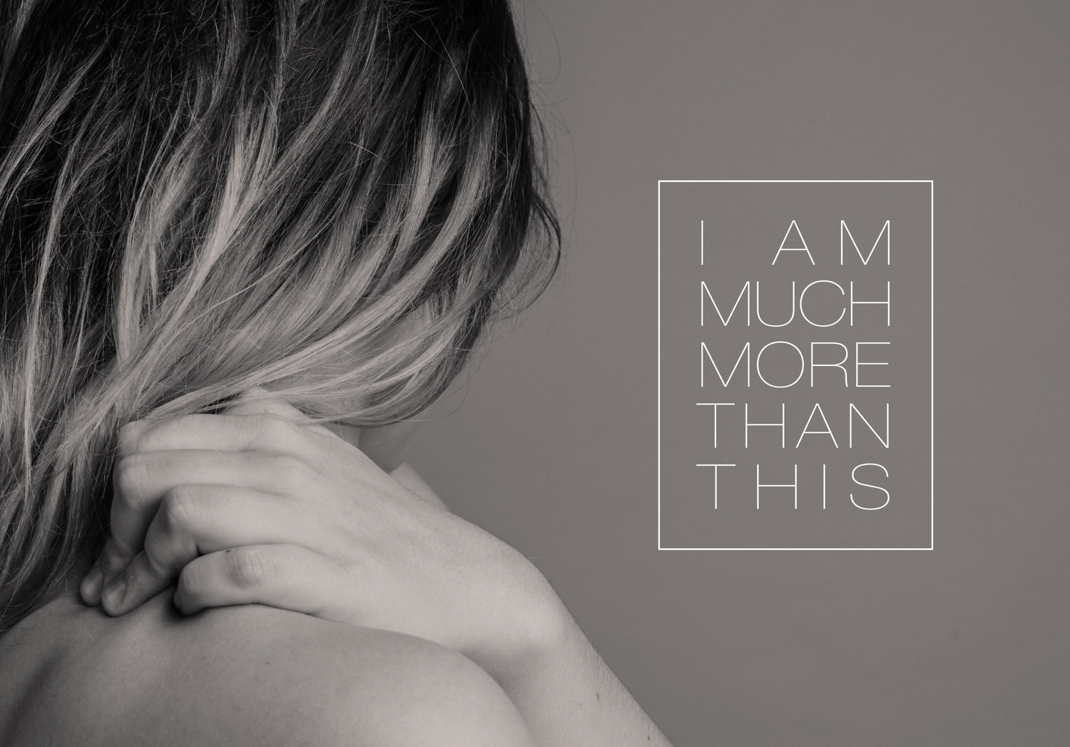
This last one I actually created after I graduated, but it was inspired by the projects I created in this class. I was still battling with personal demons, but I was finally ready to fight.